Sequential Filter - An Original Filtering ApproachRemoving irregular variations in the closing price remain a major task in technical analysis, indicators used to this end mostly include moving averages and other kind of low-pass filters. Understanding what kind of variations we want to remove is important, irregular (noisy) variations have mostly a short term period, fully removing them can be complicated if the filter is not properly selected, for example we might want to fully remove variations with a period of 2 bars and lower, if we select an arithmetic moving average the filter output might still contain such variations because of the ripples in the frequency response passband, all it would take is a variation of high amplitude for that variation to be clearly visible.
Although all it would take for better filtering is a filter with better performance in the frequency domain (gaussian, Butterworth, Bessel...) we can design innovative approaches that does not rely on the model of classical moving averages, today a new technical indicator is proposed, the technical indicator fully remove variations lower than the selected period.
The Indicator Approach
In order for the indicator output to change the closing price need to produce length consecutive up's/down's, length control the variation threshold of the indicator, variations lower than length are fully removed. Lets see a visual example :
Here length = 3, the closing price need to make 3 consecutive up's/down's, when the sequence happen the indicator output is equal to src , here the closing price, else the indicator is equal to its precedent value, hence removing other variations. The value of 3 is the value by default, this is because i have seen in the past that the average smallest variations period where in general of 3 bars.
Because the indicator focus only on the variation sign, it totally ignore the amplitude of the movement, this provide an effective way to filter short term retracement in a fluctuation as show'n below :
The candle option of the indicator allow the indicator to only focus on the body color of a candle, thus ignoring potential gaps, below is an example with the candle option off :
If we activate the "candle" option we end up with :
Note that the candle option is based on the closing and opening price, if you use the indicator on another indicator output make sure to have the candle option off.
Length and Indicator Color
The closing price is infected by noise, and will rarely make a large sequence of consecutive up's/down's, the indicator can therefore be useful to detect consecutive sequence of length period, here 6 is selected on BTCUSD :
A consecutive up's/down's of period 6 can be considered a relatively rare event.
It is important to note that the color of the indicator used by default has nothing to do with the consecutive sequence detected, that is the indicator turning red doesn't necessarily mean that a consecutive down's sequence has occurred, but only that this sequence has occurred at a lower value than the precedent detected sequence. This is show'n below :
In order to make the indicator color based on the detected sequence check the "Color Based On Detected Sequence" option.
Conclusion
An original approach on filtering price variations has been proposed, i believe the indicator code is elegant as well as relatively efficient, and since high values of length can't really be used the indicator execution speed will remain relatively fast.
Thanks for reading !
Cari dalam skrip untuk "Up down"

Market Delta [Makit0]MARKET DELTA INDICATOR v0.5 beta
Market Delta is suitable for daytrading on intraday timeframes, is a volume based indicator which allows to see the UP VOLUME vs the DOWN VOLUME, the DELTA (difference) and the CUMULATIVE DELTA (cumulative sum of difference) between them
This indicator is based on contracts volume (data avaiable), not in ask/bid volume (data not avaiable)
The up/down volume is calculated at each candle as follows:
- calculate the ticks of the range, top wick and bottom wick
- calculate the ticks up and ticks down to get the total ticks of the candle
- calculate the volume per tick as total volume divided by total ticks
- calculate the up and down volume as volume per tick multiplied by up ticks and down ticks
The delta is calculated as volume up minus volume down
The cumulative delta is a cumulative sum of delta and is resetted to 0 twice a day at the globex open and at the us cash open
By default the indicator plots the 'CANDLE MODE' which is useful for charting the cumulative volume to find out support and resistance zones where the volume is rejected or pass thru, as the volume moves so does the price, price always follows the volume, price goes away from where volume dries and price auctions comfortable where is plenty of volume, in a way PRICE FEEDS ON VOLUME
An indication about the plotting style in the volume, delta and cumulative delta modes: I can't use histogram as intended due a bug at autoresizing the scale in the candle mode, so the styles used are areabr and circles.
FEATURES
- Plot volume in one of four modes: Volume Up/Down, Delta, Cumulative Delta, Cumulative Delta as Candles
- Cumulative delta resetted twice a day (globex and cash open)
- Show a base line at 0
SETTINGS
- Mode: select one of the four volume output modes: Volume, Delta, Cumulative Delta and Candles. Candles by default
- Show zero line: show/hide the zero base line. False by default.
HOW TO SETTING UP THE INDICATOR:
BE AWARE, by default the indicator settings are configured for using the Cumulative Delta Candle Mode
- Candles Mode Settings: configured by default, mode candles and zero line off
- Volume, Delta, Cumulative Delta Mode Settings: select the mode you want and switch on/off the zero line
GOOD LUCK AND HAPPY TRADING

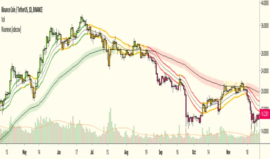
Rivanews Setup - Riva-Keltner, Média Rock [xdecow]This setup was created by Rivadavila S. Malheiros
There are 2 Keltner Channels with exponential moving averages of 21 (riva) and 89 (rock) and ATR multiplier of 0.618.
When the price is between the bands, it is a sign of consolidation (yellow).
When the price is above the bands, it is an upward trend (green).
When the price is below the bands, it is a downward trend (red).
When the price crosses rock 89 and closes up / down, it may be a sign of a reversal. But it has a high probability of testing rock 89 again.
------------------------------------------------------------------------------------------
PT-BR
Este setup foi criado por Rivadavila S. Malheiros
São 2 Keltner Channels com médias móveis exponenciais de 21 (riva) e 89 (rock) e multiplicador do ATR de 0.618.
Quando o preço está entre as bandas, é sinal de consolidação (amarelo).
Quando o preço está acima das bandas, é uma tendencia de alta (verde).
Quando o preço está abaixo das bandas, é uma tendencia de baixa (vermelho).
Quando o preço cruza a rock 89 e fecha acima/abaixo, pode ser sinal de reversão. Mas tem uma alta probabilidade de testar a rock 89 novamente.
Multi-TF Avg BBandsMULTI-TF AVERAGE BBANDS - with signals (BETA)
Overall, it shows where the price has support and resistance, when it's breaking through, and when its relatively low/high based on the magic of standard deviation.
created by gamazama. send me a shout if u find this useful, or if you create something cool with it.
%BB: The price's position in the boilinger band is converted to a range from 0-1. The midpoint is at 0.5
Description of parameters
"BB:Window Length" is the standard BB size of 20 candles.
The indicator plots up to 7 different %BB's on different timescales
They are calculated independently of the timescale you are viewing eg 12h, 3d, 30m will be the same output
You can enter 7 timescales, eg. if you want to plot a range of bbands of the 12h up to 3d graphs, enter values between 0.5 and 3 (days) - you can also select 0 to disable and use less timescales, or select hours or minutes
Take note if you eg. double the main multiplier to 40, it is the same as doubling all your timescales
You can turn the transparency of the 7 x %BB's to 100 to hide them, their average is plotted as a thick cyan line
"Variance" is a measure of how much the 7 BB's agree, and changes colour based on the thresholds used for the strategy
---- TO START FROM SCRATCH ----
- set all except one to ZERO (0), set to 0, and everything after to 0.
Turn ON and right click -> move the indicator to a new pane - this will show you the internal workings of the indicator.
Then there is a few standard settings
"Source Smoothing Amount" applies a basic small sma on the price.
It should be turned down when viewing candles with less information, like 1D or more.
Standard BBands use an SMA, there one uses a blend between VWMA or SMA
Volume Weight settings, the same as SMA at 0, and the same as VWMA at 1
BB^2 is a bband drawn around the average %BB. Adjust the to change its window length
The BB^2 changes color when price moves up or down
Now its time to look at the parameters which affect the buy/sell signals
turn on "show signal range" - you see some red lines
buy and sell each have 4 settings
min/max variance will affect the brigtness of the signal range
range adjust will move the range up/down
mix BB^2 blends between a straight line (0) and BB^2's top or bottom (1)
a threshold of "variance" and "h/l points" is available to generate weaker signals.
these thresholds can be increased to show more weak signals
ONCE YOU ARE HAPPY WITH THE SIGNALS being generated, you can turn OFF , and move it back to the price pane
the indicator then draws a bband around the price to maps some info into the chart:
fills a colour between 0.5 & the mid BB^2 and converts relative to the price chart
draws a line in the middle of the midband.
controls how much these lines diverge from the price - adjust it to reduce noise
converts the signal range (red lines) to be relative to the price chart
if you like, you can adjust the sell & buy signals in the tab from and to and to match the picture. It messes with auto-scaling when moving back to though
enjoy, I hope that is easy enough to understand, still trying to make this more user-friendly.
If you want to send me some token of appreciation - btc: 33c2oiCW8Fnsy41Y8z2jAPzY8trnqr5cFu
I promise it will put a fat smile on my face
Karobein OscillatorDeveloped by Emily Karobein, the Karobein oscillator is an oscillator that aim to rescale smoothed values with more reactivity in a range of (0,1)
Calculation
The scaling method is similar to the one used in a kalman filter for the kalman gain.
We first average the up/downs x, those calculations are similar to the ones used for calculating the average gain/loss in the relative strength index.
a = ema(src < src ? x : 0,length)
b = ema(src > src ? x : 0,length)
where src is a exponential moving average of length period and x is src/src in the standard calculations, but anything else can be used as long as x > 0 .
Then we rescale the results.
c = x/(x + b)
d = 2*(x/(x + c*a)) - 1
How To Use
It is better to use centerline-cross/breakouts/signal line.
In general when we use something smooth as input in oscillators, breakouts are better than reversals, you can see this with the stochastic and rsi.
So a simple approach could be buying when crossing over 0.8 and selling when crossing under 0.2.
Here is the balance of a strategy using those conditions, length = 50 .
20 trades have been mades since the 29 oct we made 341 pips with eur/usd, of course this backtest was made during good trends period,
this result is not representative of how the strategy work with other conditions/markets.
For any questions/suggestions feel free to contact me

Katana Gaps Bounty Hunter Pro (Show Gaps of All Types) by RRBKatana Gaps Bounty Hunter Pro (KGB Hunter Pro, Gap Exterminator) by RagingRocketBull 2018
Version 1.0
This indicator shows/counts/filters gaps on a chart.
There are several versions: Simple, Pro, Advanced and Zones. This is the Pro version. The Differences are listed below.
- Simple: shows/counts gaps, changes color based on gap dir (2 colors), filters out price gaps within session, large gaps, and high volume gaps
- Pro: +shows all types of gaps, multi color, pro filters (full/partial/overlapping time, price, large, candle, volume, doji, weekend gaps within delta ranges)
- Advanced: +session times mask, show/count gaps only for last N bars, +min/max/filled gaps stats, dark mode
- Zones: +shows gaps as dynamic horiz zones
KGB Hunter Pro Gap Exterminator focuses on showing you all possible types of gaps in multiple colors. Gap theory states that price tends to return and fill the gaps,
so you can use it to collect the bounty. You can apply any combination of complex filters to narrow down search results i.e., find only all:
- type 3 gaps up with allowed wick-candle overlapping of up to 10% and
- gap size larger than 200 and
- with at least one of the candles larger than 100 and
- volume change at least 40 and
- spanning less than 2 bar periods and
- excluding weekend gaps
Features:
- highlights gaps using barcolor and plotchar chars (8 colors x 2 dirs)
- supports all 3 types of gap overlapping: full gap (no overlapping), wick-wick and wick-body overlapping up to a specified % of candle body
- finds all types of gaps with pro filters for price, time, large, volume, timerange, candle size, doji gaps
- individual show/hide flags for each gap/char based on gap type
- can show/hide gaps/chars based on gap dir
- changes color of gaps/chars based on gap dir/type, multi color gap type combos
- displays chars above/below bar based on gap dir
- can show/hide weekend gaps
- counts all filtered gaps
Colors:
Basically There are 2 gap types (Price, Time) x 2 directions (Up, Down) x 2 modifiers (Large, Volume), Volume Gap is a separate class with its own modifiers, so more accurately:
- (Price, Time) x 2 directions (Up, Down) x Large modifier
- (Price Volume, Time Volume) x 2 directions (Up, Down) x Large modifier
using a total of 16+1 colors or 8+1 base colors + transparency modifier
depending on settings you can highlight gaps using any multi color combo from just 1 to all 16 colors (+1 gray color for weekends).
basic gap = 1 base color with normal transparency
price,time = 2 base colors (including basic gap) with normal transparency (+1 color)
* up,down dir = +2 new base colors with normal transparency (including 2 base colors), with a total of 2*2 = 4 price/time base colors (+2 colors)
* large = same 4 base colors with vivid transparency modifier (+4 colors)
* volume = +2 new base colors with normal transparency, a separate class (+2 colors)
* volume * up,down dir = +another 2 new base colors with normal transparency (including 2 volume base colors), with a total of 2*2 = 4 volume base colors (+2 colors)
* volume * large = 4 volume base colors with vivid transparency modifier (+4 colors)
weekend_gap = gray (+1 color)
doji gap, candle gap, timerange gap = no special color, inherits color from parent gap type
for more details, please see the Gap Color Hierarchy comments in code
_________________________________________________________________________
You can find the following gap related terminology in literature: full, partial, extreme, breakaway, runaway/continuation, common, exhaustion gaps.
There are no exact rules to distinguish between them, so this can't be implemented.
When defining a gap it all boils down to how do you plot a gap, which points between adjacent candles do you consider a gap. Different sources apply different methodology
but in practice only 3 types of gap overlapping can exist:
- full gap (no overlapping),
- partial (wick-wick overlapping) and
- extreme partial (wick-body overlapping up to a specified % of a candle body)
All these types are supported in this script. The only possible remaining option is candle-candle overlapping which is not a gap by definition.
Many other script specific subtypes are also supported. Please see description of each gap type below and comments in code.
General display modes
- gap has 3 possible overlapping modes: full gap (no overlapping), wick-wick overlapping, wick-candle overlapping up to a specified % of candle body size (for mode 3 only)
the remaining candle-candle overlapping implies not a gap by definition
full gap mode will find the least amount of gaps, wick-candle - the most
- gap can be either price or time, up or down, and shown above or below the candles (gap chars)
- by definition, a price gap is a smaller subset of a time gap, a gap within current session with a price gap and zero time lag between bars.
Therefore timerange filter is useless for price gaps, but can still be applied.
On the other hand, all price gap filters can be applied to time gaps without any distinction.
- gap can have multiple modifier subtypes: (price|time) * (up|down) * (large? + volume? + doji? + timerange? + weekend?)
i.e. price + large + volume + doji or time + large + volume + timerange + doji + weekend
- the gap is always counted only once no matter how many subtype modifiers it has
- if the gap does not satisfy any of the applied flags/filters it is not shown/counted (no gap bars/chars are shown)
- gap color can depend on a combo of gap type/dir and modifier subtypes or can be shown in a single base color
- char color can only depend on gap dir (not type/modifiers) or can be shown in a single base color
- char position can also depend on gap dir (above/below) the gap candle. Alternatively you can pin chars to the top/bottom of the screen in UI Styles.
- change_by_type = true - uses gap type base colors (2 colors + optional modifiers, up to 8 colors if volume and/or large filters are enabled)
- change_by_dir = true - uses gap dir base colors (2 colors + optional modifiers, up to 8 colors if volume and/or large filters are enabled)
- both change_by_type and change_by_dir = true - uses both gap type and dir base colors (4 colors + optional modifiers, up to 16 colors if volume and/or large filters are enabled)
- both change_by_type and change_by_dir = false - uses a single base gap color (1 color)
- don't need that much colors - disable filters
- highlight bars has priority over individual gap flags, when it is false all gaps are hidden regardless of their corresponding flag settings (does not affect dim weekend gaps)
- show chars has priority over individual gap char flags, when it is false all char flags are hidden regardless of their corresponding flag settings
- price gaps are only shown/counted when show_price_gaps flag is true. The large or volume filters can be used to narrow down results further.
- time gaps are only shown/counted when show_time_gaps flag is true. The large, volume, and timerange filters can be used to narrow down results further.
- doji gaps are only shown/counted when show_doji_gaps flag is true. The doji candle size and other filters can be used to narrow down results further.
- show weekend gaps = true and dim weekend gaps = false - shows/counts weekend gaps
- show weekend gaps = true and dim weekend gaps = true - dims weekend gaps, doesn't show/count weekwend gaps
- show/dim weekend gaps do just that - show the gap if it happens on a weekend, not all weekends
- large gaps are only shown/counted when the large filter is enabled != 0. positive values 5 (>= 5), negative -5 (<=5) are used to switch between <>
- volume gaps are only shown/counted when the volume filter is enabled != 0. positive values 5 (>= 5), negative -5 (<=5) are used to switch between <>
- timerange gaps are only shown/counted when the timerange filter is enabled != 0. positive values 5 (>= 5), negative -5 (<=5) are used to switch between <>
- candle size gaps are only shown/counted when the candle size filter is enabled != 0. positive values 5 (>= 5), negative -5 (<=5) are used to switch between <>
- candle size filter is the only filter with 2 arguments, use_and_for_delta to enable AND condition for the args (OR is the default)
Good Luck! Feel free to explore and learn from the code

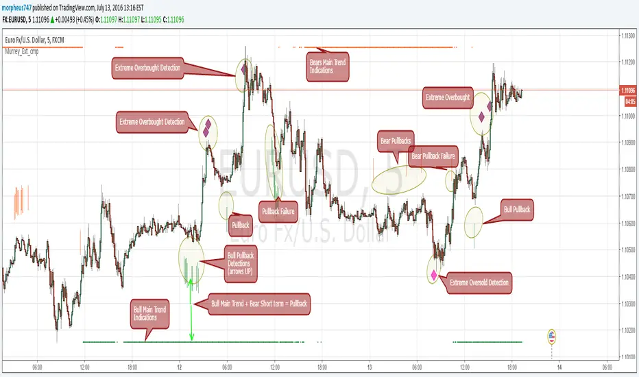
Murrey Math Extremes ComparatorHOW IT WORKS
Creates two murrey math oscillators (hidden) one with 256 length another with 32 length and compare each other.
WHAT GIVE ME THIS SCRIPT
The script can give you very valuable information:
- Main Trend
- Pullbacks detections
- Extreme overbought oversold prices alerts
- Divergences
- Any timeframe usage
REFERENCES OF USAGE
Main Trend Indications
****The main trend is indicated with green(bull) or red(bears) small "triangles" on the bottom(bull) or the top(bears) of the chart.
*****To detect the Bull/Bear major trend the script use 256 murrey, if > 0 (green) we are uptrend in other cases we are downtrend
Pullback detection
****The pullbacks are indicated with Green(bull) or red(bears) medium "Arrows"
*****To detect pullbacks the system compare the long term murrey with the short term murrey, if long term is Green(green triangles)
*****so we are in a main bull trend, if the short term murrey make an extreme low then the pullback is indicated
*****The same for the short pullback, if long term murrey is RED and we have an extreme green short term murrey we shot a red arrow
Extreme Overbught/Oversold
****The extreme OO is indicated with fancy diamonds
*****To detect the Extremes price movements we combine the two murrey, if Long Term Murrey is overbought and short term murrey too
*****Then the diamond show on the screen obove or below based on the extreme if overbought or oversold
Strategy Resume:
Triangles indicate Major Trend Up/Down
Arrows Indicate Continuation pullbacks
Diamonds Indicate Extreme Prices
GUIDE HOW TO IMAGES
How it's works Behind Scene
Kay_BBandsV3This is the 3rd version of Kay_BBands.
When +DI (Directional Index ) is above -DI , then Upper band will be visible and vice-versa.
This is when the ADX is above the threshold. 28 is the default in this version. I found its more appealing in 5M time frame.
BLUE - ADX under 10
GREEN - Uptrend, ADX over 10
RED - Downtrend, ADX over 10
Use it with another band with setting 20, 0.6 deviation. Prices keeping above or below the 2nd bands upper or lower bounds shows trending conditions.
I didn't know how to update the old script so published it again.
Changes - :
1) Updated default settings for the indicator
2) ADX setting are now DI (28), ADX (10), adx level to check is 10.
3) IMPORTANT one - When DI is up/down, lower/upper band will also have color (more visible that way.)
Play around the settings.. It really eliminates extra indicator checking visually... Please like if you think idea is good.

CM ATR PercentileRankCM ATR PercentileRank - Great For Showing Market Bottoms.
When Increased Volatility to the Downside Reaches Extreme Levels it’s Usually a Sign of a Market Bottom.
This Indicator Takes the ATR and uses a different LookBack Period to calculate the Percentile Rank of ATR Which is a Great Way To Calculate Volatility
Be Careful Of Using w/ Market Tops. Not As Reliable.
***Ability to Control ATR Period and set PercentileRank to Different Lookback Period
***Ability to Plot Histogram Just Showing Percentiles or Histogram Based on Up/Down Close
Fuchsia Lines = Greater Than 90th Percentile of Volatility based on ATR and LookBack Period.
Red Lines = Warning — 80-90th Percentile
Orange Lines = 70-80th Percentile
Other Useful Indicators
Williams Vix Fix
CM_RSI EMA Is a Great Filter for Williams Vix Fix

Target Ladder Pro - MTF ATR + HIT ConfirmationTarget Ladder Pro is a volatility-based target framework that plots multi-timeframe ATR-derived upper and lower reference levels on the price chart and can optionally print HIT confirmations when a defined ATR target is reached.
This script is designed to provide structured volatility context (reach zones, range framing, and objective “target reached” tagging). It does not predict price direction, does not guarantee outcomes, and is not intended as a standalone signal generator.
What This Script Displays
1) Multi-Timeframe ATR Target Ladder (1H / 4H / 1D / 1W)
For each enabled timeframe, the script calculates ATR using higher-timeframe data via request.security() (no lookahead), then plots:
Upper level: Base + ATR × Multiplier
Lower level: Base − ATR × Multiplier
The “Base” can be set to:
the current chart price (for immediate relevance), or
the timeframe’s own close (for a strict MTF reference)
Each timeframe’s upper and lower levels are drawn as price-chart lines.
Last-Bar Target Balloons (per timeframe)
On the last bar, the script prints balloon labels for each timeframe’s upper and lower level. Horizontal x-offsets are configurable per timeframe to keep stacked labels readable.
2) ATR Target + Deviation Bands (Context Layer)
A separate ATR target module calculates a single ATR reference level for the current bar based on candle direction (up/down close relative to the prior close). It also optionally plots:
a mean line (moving average), and
up to four standard-deviation bands (mean ± N × deviation)
These bands provide statistical range context around price.
Target / HIT Labels (per bar)
When enabled:
a Target label marks the computed ATR target level
a HIT label appears when price reaches that target on the same bar (high/low touch rule)
An optional filter can require that the ATR target is inside the first deviation band before printing a HIT label, reducing HIT labels during extended conditions.
Label history can be limited to the most recent N labels or allowed to persist (with a safety cap).
How to Use
Enable the timeframes you want to display (e.g., 1H / 4H / 1D / 1W).
Adjust ATR length and multipliers per timeframe to match the asset’s volatility profile.
Choose whether MTF ladder levels are anchored to current price or the timeframe’s own close.
Use the ladder levels as volatility reach reference zones above and below price.
Use Target/HIT labels as objective “condition occurred” markers for review and journaling.
Notes and Limitations
ATR levels are volatility references, not forecasts or guarantees.
Targets may be reached frequently in high-volatility regimes and rarely in compressed markets.
HIT labels indicate that a defined volatility condition occurred; they do not imply reversal or continuation on their own.
This script is provided for informational and educational purposes only and does not constitute financial advice.


Playbook Regime &Setups PublicPlaybook (Public) is a market-structure and regime framework designed for intraday traders who want clearer context before taking discretionary entries. It classifies conditions as UP / DOWN / RANGE using EMA alignment and trend strength, then highlights breakout and pullback readiness in the direction of the active regime. A simple confidence score and session context are included to help filter lower-quality conditions. Market regime + setup readiness (breakout/pullback) with confidence & session context.
How to use
Start with the Regime (UP/DOWN/RANGE). Prioritize trades aligned with the regime.
Use Ready / Setup status as a qualification layer, not a standalone entry system.
Use Confidence as a filter (higher confidence = stronger trend alignment / separation).
If enabled, VWAP bias can be used as an additional directional filter.
Notes / limitations
Intended for intraday charts and liquid markets.
Signals are evaluated on bar close.
This script is a framework for context and qualification only. It is not financial advice.

Short-Term Weekly Refuges (Shelters)## // Introduction //
══════════════
Short-Term Weekly Refuges (Shelters) (WR or RS) is a structural analysis indicator designed to track price action during the current week. It combines a configurable ZigZag with Fibonacci retracements anchored to recent phases, using the Weekly Opening Price (W.O.P.) as a key reference level.
This indicator is optimized for 4H timeframe but also works on 1H and 15min charts.
## // Theoretical Foundation of the Indicator //
═══════════════════════════════
The WR (RS) indicator provides a structural framework for following price action during the current trading week.
The core concept: Recent ZigZag phases, combined with the Weekly Opening Price, create dynamic support and resistance levels that institutional traders often monitor and use for intraweek positioning. The indicator allows you to select which recent phase (1-10) serves as the Fibonacci anchor.
## // Indicator Objectives //
══════════════════
1) Display a configurable ZigZag showing recent price structure with numbered phases (1 = most recent). Users should configure the ZigZag parameters based on whether they are analyzing a Major Degree Pattern (larger swings, less noise) or a Minor Degree Pattern (smaller swings, more detail), following standard Elliott Wave terminology. Configure the ZigZag to match the degree of your analysis: use higher Depth values for Major Degree Patterns, or lower values for Minor Degree Patterns.
2) Draw Fibonacci retracements on a user-selected phase, with two modes:
• "On ZigZag": Traditional Fibonacci on the selected phase.
• "Relative to W.O.P.": Fibonacci from phase anchor (i0) to Weekly Opening Price.
3) Show Weekly Opening Price lines as horizontal references, with the current week's line extended into the future.
4) Provide Pivot Up/Down markers for additional confirmation of local highs and lows.
5) Support multiple simultaneous indicator loads with visual identifier labels to distinguish between different analysis degrees (e.g., "Major Degree Pattern" vs "Minor Degree Pattern").
6) Optional Embedded Indicator: Enable Intraday Shelters (RID) - percentage-based support/resistance levels calculated from the Daily Opening Price, useful for 1H and 15min trading.
## // Key Features //
══════════════
• **Flexible ZigZag**: Adjustable Depth, Deviation, and Backstep parameters to adapt to any asset's volatility.
• **Phase Selection**: Choose from the 10 most recent phases for Fibonacci anchoring.
• **Dual Fibonacci Modes**: Trace on the ZigZag phase itself, or relative to the Weekly Opening Price.
• **New Age Color Palette**: Professional Fibonacci color scheme used by old school experienced traders.
• **Weekly Opening Price (W.O.P.)**: Historical weekly opens plus current week projection.
• **"Show Only W.O.P." Mode**: Isolate just the Weekly Opening Price line for cleaner charts on non-4H timeframes.
• **Optional Intraday Shelters (RID)**: 11 percentage levels (±0.382%, ±1%, ±1.5%, ±2%, ±2.5%) based on Daily Opening Price.
• **Multi-Load Support**: Visual identifier tags and Large Label for running multiple indicator instances simultaneously.
## // Recommended Workflow //
═════════════════════
1) Load the indicator on a 4H chart.
2) Adjust ZigZag parameters (Depth, Deviation) until the phases match your visual analysis of recent price structure.
3) Select the phase you want to use as Fibonacci anchor (typically Phase 2, 3 or higher).
4) Choose Fibonacci mode: "On ZigZag" for phase analysis, or "Relative to W.O.P." for analysis based on weekly opening price context.
5) Monitor how price interacts with the Fibonacci levels and Weekly Opening Price throughout the week.
6) Optionally enable RID for intraday precision on 1H or 15min charts.
## // Integration with Other Refuge Indicators //
════════════════════════════════
WR (RS) is part of a complete refuge-based analysis ecosystem:
• LTR (RLP) (Long-Term Refuges): For automatic determination of the predominant phase of a ZigZag, which institutional investors choose as the basis for a Fibo whose levels calculate the projection for order placement over the following months and years.
• LTRS (RLPS) (Simple Long-Term Refuges): Simplified version of LTR in which the known coordinates of the predominant phases (obtained with the LTR indicator) of one or up to five assets are easily captured for permanent long-term operation.
• WR (RS) (Short-Term Weekly Refuges): (This indicator) For short-term tactical analysis (4H, 1H) based on chosen phases of a ZigZag that define Fibo levels generated during the near past week(s) and probably effective in the present week.
• IDR (RID) (Intra-Day Refuges): For daily operations relying on intraday levels on timeframes of 1H or less. Ideal for scalping traders.
By combining LTR, LTRS, WR and IDR, you obtain a multi-level framework that allows you to operate with clarity at any time horizon, from intraday positions to investments spanning months and years.
## // Additional Notes //
════════════════
1) Default parameters are optimized for volatile assets (crypto, tech stocks). For forex or less volatile instruments, consider reducing Deviation to 3-8%.
2) The "Phase in Development" (dashed line) shows the tentative current ZigZag segment that may still change as new bars form.
3) Bug reports, improvement proposals for the ZigZag generator, pattern determination, or Fibo composition, etc., will be greatly appreciated and taken into account for a future version. Best regards and happy hunting.
(Sorry: Spanish translation erased trying to avoid confusing publishing banning rules).

Multi-Timeframe Trend Indicator with RSIEnhanced version of the original Multi-Timeframe Trend Indicator by @Ox_kali
This indicator analyzes trend direction across multiple timeframes using moving average crossovers. The original version by @Ox_kali has been enhanced with RSI (Relative Strength Index) functionality for more comprehensive market analysis.
Key Features:
- Multi-Timeframe Trend Analysis : Compares short-term vs. long-term moving averages across 14 different timeframes
- RSI Enhancement : Adds RSI readings for each timeframe with configurable overbought/oversold levels
- Visual Table Display : Shows trend direction (Up/Down) and RSI values in a color-coded table
- Average Trend Calculation : Computes an overall market bias from all active timeframes
- Customizable Alerts : Notifies on trend reversals and RSI extremes
Credits:
Original Multi-Timeframe Trend Indicator by @Ox_kali • RSI enhancement added for improved momentum analysis.

EMA Fractal Bias"EMA Fractal Bias" overlays on TradingView charts to detect directional bias for scalping on futures like NQ/ES.
It computes three smoothed EMAs (fast 3/2, mid 9/3, slow 20/5, configurable) for stacking checks (bullish: fast > mid > slow; bearish: reverse).
Williams Fractals (period 2 default) identify potential breaks: close above up-fractal high for long, below down-fractal low for short.
Bias logic: Tracks last up/down fractal. On break, if stacked aligns, sets bias (long/short) and resets broken fractal. If no stack, sets pending flag and neutral bias; confirms on later bars if stack turns true.
Shading teal for long, purple for short, orange for neutral, with intra-bar previews.
Debug toggle adds event labels and status on last bar.
Non-repainting, evaluates on close.

SilverHawk Trend FlowSilverHawk Trend Flow
This indicator colors candles based on trend direction using a smoothed momentum calculation.
Features:
• Trend candles colored green/red based on direction
• Alerts on new up/down trend detection
Settings:
• Show Trend Candles: toggle colored candles on/off (default true)
• Enable Alerts: toggle trend change alerts (default true)
• Up Low/High & Down Low/High: customize candle gradient colors
Best used on H1 to D1 timeframes for identifying trend changes in Forex or indices. Combine with proper risk management and confirmation.
Educational tool only. Not financial advice. Trading involves risk.

Institutional Confluence Nexus [Pro]The Problem: Noise vs. Signal
In the world of Smart Money Concepts (SMC), traders are often overwhelmed by "chart clutter." Standard indicators blindly highlight every Fair Value Gap (FVG) and Order Block (OB), regardless of whether the market is trending, ranging, or dead. This leads to analysis paralysis and low-probability entries.
The Institutional Confluence Nexus was built to solve this. It is not just a structure detector; it is a filtering engine. It uses a multi-factor model to hide low-probability zones and only highlight setups where Structure, Volume, and Momentum align.
The "Quantum" Integration
This script includes a built-in Quantum Regression Oscillator (QRO) engine running in the background. Unlike standard RSI or MACD which are reactive (lagging), the QRO uses Linear Regression mathematics to project momentum trajectory.
By combining institutional structure (Price Action) with quantum momentum (Math), this tool generates specific high-probability signals that only appear when price action and momentum are in perfect agreement.
How It Works & Visual Guide
This indicator is a complete trading suite. Here is what every symbol and color on your chart represents:
1. The "Nexus" Reversal Signals (Triangles)
Symbol : Green Triangle (Up) / Red Triangle (Down) labeled NEXUS.
Logic : These appear when price taps a valid Order Block that aligns with the macro trend (200 EMA).
Meaning : These are your primary "Trend Join" setups. They indicate that the institutional trend is resuming after a retracement.
2. High-Volume Breakouts (Bar Colors)
Symbol : Yellow Candles (Bullish) / Orange Candles (Bearish).
Logic : The script detects when a Break of Structure (BOS) occurs with Above-Average Volume.
Meaning : A breakout without volume is often a fakeout. These colored bars confirm that institutions are fueling the move. If you see a Yellow bar, it means "Smart Money" is buying the breakout.
3. QRO Confluence Signals (Labels)
These are the most advanced signals in the suite, combining Price Action with the internal Oscillator:
SNIPER (Blue/Purple) : The strongest reversal signal.
Condition : Price taps a Fair Value Gap + The internal QRO is at extreme volatility bands (Oversold/Overbought).
PB BUY / PB SELL (Aqua/Orange) : A trend continuation signal.
Condition : Price pulls back into a Fair Value Gap + The internal QRO confirms momentum is still healthy (above/below midline).
Note : These signals automatically draw a Red Line at the invalidation point (Stop Loss) to help you manage risk immediately.
4. The Confluence Dashboard
A non-intrusive Heads-Up Display (HUD) in the corner gives you a snapshot of the market state:
Trend : Is price above/below the 200 EMA?
Volume : Is current volume anomalous (High) or normal?
Structure : Are we breaking up, down, or ranging?
Settings & Customization
Smart Money Structure: Toggle FVGs and Order Blocks on/off.
FVG Extend: Control how far the gap "zones" extend to the right to see them as support/resistance zones.
Volume Filter: Enable/Disable the volume requirement (Keep enabled for higher strike rate).
Risk Management: Adjust the "Lookback" period for the automatic Stop Loss lines.
For Developers (Open Source)
I have kept the code open-source to foster learning in the Pine Script community. You can study how:
ta.linreg is used to smooth RSI data for the internal QRO engine.
box.new and line.new are used for dynamic drawing and extending zones.
var variables are used to store historical FVG levels to detect precise crossovers.
Disclaimer:
This tool is designed to assist with technical analysis and educational purposes. It does not guarantee profits. Always manage your risk and use this in conjunction with your own analysis.

Auto Fib Prev-Week Only for [4H+ Swing]Maps the previous week Fib levels:
Captures real supply & demand.
Defines where price was accepted or rejected.
Creates levels that current price must respect.
This indicator locks those levels in place and extends them forward.
What the levels represent:
- Previous Week High / Low
- Major boundaries. Breaks require momentum.
- 50% Level
- Balance point. Chop and indecision are common here.
- 61.8% Levels (Bull & Bear)
- Primary mean-reversion zones.
- Most reliable reaction levels.
- 78.6% Levels
- Last defense before trend failure or expansion.
- Extensions (1.214 → 2.618 / negatives)
- Exhaustion and target zones.
Working....
Dashboard (bottom-right)
- Nearest Sup / Res – Closest actionable level
- On Level? – Price is currently reacting at a level
- UpBreak% / DnBreak% – Probability of breaking vs rejecting
- Bias – Market posture (UP / DOWN / NEUTRAL)
- Tol – Sensitivity used for level detection
BLUF: Maps last week’s structure forward to identify high-probability reaction zones and whether price is more likely to revert or break.

ACHT EMA Cross Pullback Strategy with HTF Filter, RSI SignalsADVANCED INDICATOR FOR TRADING USING EMA CROSS PULLBACK STRATEGY
✨ MAIN FEATURES:
• 📈 Signals on pullback after EMA9/EMA20 crossover
• 🔍 Multi-level signal filtering
• 🕒 Multi-timeframe analysis (HTF filter)
• 🛡️ Trend indicator protection
• 📊 Compact information panel
🎯 MAIN SIGNALS:
1️⃣ EMA CROSS + PULLBACK
• EMA9 crosses EMA20 up/down
• Price pullback to EMA9 after crossover
• EMA200 filter (bullish/bearish trend)
2️⃣ RSI SIGNALS IN HTF ZONES
• RSI crossing its SMA
• Works only in HTF zones
• "First signal only" option in zone
🛡️ INDICATOR FILTERS:
• ✅ SuperTrend - main trend identification
• ✅ MACD - additional trend confirmation
• ✅ RSI - overbought/oversold filter
• ✅ HTF filter - higher timeframe analysis
⚙️ CUSTOMIZATION OPTIONS:
• Adjustable periods for all indicators
• Enable/disable each filter
• RSI level settings
• HTF filter timeframe selection
• Signal visualization options
📱 INFORMATION PANEL:
• Compact table with key metrics
• Status of all filters and indicators
• Visual HTF zone indicators
• Emoji for quick perception
🚨 ALERT SYSTEM:
• Alerts on main signals
• Alerts on HTF zone entry
• Alerts on RSI signals
• Customizable trigger conditions
📈 USAGE RECOMMENDATIONS:
1. Wait for EMA9 and EMA20 crossover
2. Look for price pullback to EMA9
3. Check all filter compliance
4. Ensure HTF zone presence
5. Use RSI signals as supplement
⚠️ RISKS AND LIMITATIONS:
• Indicator doesn't guarantee profit
• Always use stop-losses
• Test strategy on demo account
• Adapt parameters to your trading style

Market Regime: Squeeze Box + Trend DashboardMarket Regime: Squeeze Box + Trend Dashboard
Market Regime is a overlay designed to provide instant market context (trend vs consolidation) and highlight volatility compression (squeeze) setups before potential breakouts. Built with stock charts in mind, it focuses on clean visuals and practical decision support.
What this indicator shows:
1) Market Regime (TREND / RANGE / NEUTRAL)
The regime is detected using DMI/ADX with built-in confirmation to reduce flicker:
TREND : ADX stays above a threshold for N bars
RANGE : ADX stays below a threshold for N bars
NEUTRAL : neither trend nor range is confirmed
Trend direction is derived from DI+ vs DI- (UP / DOWN / MIXED).
2) Squeeze (BB inside KC)
A squeeze is detected when Bollinger Bands contract inside Keltner Channels (volatility compression).
SQZ = squeeze start
REL = squeeze release (the first bar *after* squeeze — technically correct)
3) Squeeze Box
The core feature: a box drawn from SQZ → REL , dynamically tracking the highest high / lowest low during the squeeze. This creates a clean visual range for the compression zone and helps frame breakout context.
4) EMA Ribbon with ADX-based intensity
Two EMAs (fast/slow) form a ribbon. The fill becomes more pronounced as ADX strength increases, making trend momentum easier to read at a glance.
5) Trend Dashboard (corner panel)
A compact dashboard summarizing key metrics:
REGIME, DIR, ADX (with normalized strength %)
SQUEEZE ON/OFF
Relative Volume (relVol + tier)
ATR% (14), EMA Slope%, GAP% (Open vs previous Close)
Customization / Settings
Fully configurable for different styles and markets:
ADX/DMI lengths and thresholds
BB/KC parameters (lengths and multipliers)
Relative Volume thresholds
Background mode: Off / Squeeze only / All regimes
Visual toggles: ribbon, squeeze box, markers, dashboard
History controls and limits for boxes/labels (clean chart + performance)
How to use (practical workflow)
Trend context : read REGIME + DIR and ribbon intensity (ADX strength).
Squeeze setup : when squeeze is active, the box defines the compression range (high/low).
Release : REL marks the first bar after squeeze ends (potential breakout/expansion context).
Notes
No look-ahead logic is used; calculations rely on current and historical bars only.
On realtime (still-forming) candles, values can change intrabar, normal behavior for indicators computed on the current bar.
Trading Disclaimer:
This indicator is provided for research and informational purposes only and does not constitute financial advice. Past performance is not indicative of future results. Use at your own risk. You are solely responsible for any trading decisions made using this script.

CVD - Cumulative Volume Delta Line - TheActulaSnailCVD – Cumulative Volume Delta Line
Author: TheActualSnail
Description:
The CVD (Cumulative Volume Delta) Line indicator calculates the net difference between buying and selling volume over time, helping traders visualize market pressure and order flow. Instead of bars, this version plots a smooth line representing cumulative delta, making it easier to spot trends, divergences, and resets.
Key Features:
Smooth CVD line showing cumulative volume delta.
Optional Moving Average for trend smoothing.
Configurable resets: daily, fixed higher timeframe, session start, or specific intraday time.
Zero line for reference.
Background highlights when the CVD resets.
Settings Explanation
1. CVD Resets (resetInput)
Defines when the CVD calculation resets to zero:
None: Never resets; the CVD accumulates indefinitely.
On a stepped higher timeframe: Resets at the start of each bar of a higher timeframe (e.g., daily on a 1H chart).
On a fixed higher timeframe: Resets at the start of a specific timeframe you choose (fixedTfInput).
At a fixed time: Resets at a specific hour and minute each day (hourInput and minuteInput). Works only on intraday charts.
At the beginning of the session: Resets at the start of each trading session (useful for markets with fixed open/close hours).
2. Fixed Higher Timeframe (fixedTfInput)
Used with fixed higher timeframe reset. Example: "D" = reset at the start of each day, "W" = reset at the start of each week.
3. Fixed Time (hourInput & minuteInput)
Used only with At a fixed time reset. Example: hour = 9, minute = 30 → CVD resets at 9:30 AM each day.
4. Volume Delta Calculation (vdCalcModeInput)
Volume delta: Cumulative delta = up volume − down volume.
Volume delta percent: Relative delta = (up − down) / total volume.
5. Visuals
CVD Line Colors: Green for positive delta, red for negative.
CVD MA: Optional moving average to smooth the line.
Zero Line: Reference for zero cumulative delta.
Background Color on Reset: Highlights bars when CVD resets.
Usage Notes
This indicator is for informational purposes only.
It does not provide buy or sell signals.
Always combine CVD analysis with other indicators, price action, and risk management.
Market conditions can change rapidly; use caution when making trading decisions.
Tip:
For intraday charts, consider using fixed time resets to see daily market pressure clearly.
For higher timeframe analysis, use daily or weekly resets.

Anchored OBV + A/DAnchored OBV + A/D is a single-pane indicator that allows On-Balance Volume (OBV) and Accumulation/Distribution (A/D) to be plotted together using a period-anchored approach.
OBV and A/D are cumulative by nature, which makes their full-history absolute values arbitrary and often incomparable when plotted side-by-side . This script addresses that limitation by anchoring each indicator to a user-defined period (daily, weekly, monthly, etc.) and plotting their relative change from that baseline rather than their raw values. The result is a comparison that preserves each indicator’s internal structure (trends, inflections, and divergences) while minimizing scale conflicts.
How it Works
At the start of each selected anchor period, the script records the current OBV and A/D values as baselines. All subsequent values are plotted as changes relative to those baselines:
- Percent mode measures the % change from the baseline.
- Delta mode measures the absolute change from the baseline.
Optional anchor markers and a zero line make it easy to see when resets occur and how each indicator behaves relative to the period’s starting point.
Advantages vs using OBV and A/D separately
- Direct visual comparison: Both indicators are on the same anchored scale, making relative movement immediately readable.
- Preserved analytical structure: Trends, inflections, and divergences remain intact; time-based shape is not distorted.
- Cleaner workflow: One indicator, one pane, and less chart clutter.
Interpretation
- Values above zero indicate net accumulation or positive volume pressure since the anchor.
- Values below zero indicate net distribution or negative volume pressure since the anchor.
- Trend confirmation: Rising price accompanied by rising anchored OBV and A/D suggests healthy participation.
- Price Divergence: Price making new highs or lows while one or both indicators fail to confirm can indicate weakening participation or a potential change in behavior.
- OBV vs A/D Interaction: When both move together, volume and close-location effects broadly agree. When they diverge, it highlights differences between net up/down volume (OBV) and intrabar accumulation/distribution (A/D).
Warnings!
- Percent mode can become visually unstable when baseline OBV or A/D values are near zero due to division effects inherent in percent-change calculations.
- It is not recommended to interpret structure across periods as each period is relative to a different baseline. Structure is not preserved across periods - only within each individual period.
Credits
This script is inspired by Multi-Ticker Anchored Candles (MTAC) by @SamRecio . MTAC's anchored-baseline concept and open-source nature provided an important conceptual foundation for adapting the same idea to OBV and A/D. Many thanks to @SamRecio for publishing his work openly.

ADR% / ATR / LoD dist. Table - V2ADR% / ATR / LoD Distance Table (V2) + ATR Range Lines is a simple “daily volatility dashboard” that helps you quickly judge how extended a stock is during the day and where “normal” daily movement zones sit relative to price.
It’s designed to help you answer:
“Has this stock already made most of its usual daily move?”
“Am I chasing too late?”
“Where are typical +ATR / −ATR stretch and pullback zones?”
What you’ll see
ADR% (Average Daily Range %)
Shows the stock’s typical daily travel (low → high) as a percentage.
Example: ADR% = 4% means the stock often swings ~4% in a normal day.
ATR (Average True Range)
Shows the stock’s typical daily movement in price units ($ / points).
Example: ATR = 2.50 means it often moves about $2.50 per day.
LoD dist. (Low of Day distance)
Shows how far price is from today’s Low of Day, measured relative to ATR (as a %).
Higher % = more extended away from the day’s low.
Optional: ATR Range Lines (added in this version)
You can enable two guide lines that extend to the right:
ATR Up Line = Price + ATR
ATR Down Line = Price − ATR
These act like volatility guardrails to visualize “typical daily stretch” and “typical pullback” zones.
ATR “Live vs Locked” option (important)
Lock ATR to last completed day (no intraday updates):
ON (Locked): Uses the last completed daily ATR (yesterday’s finished value).
✅ ATR stays constant all day while the market is live.
OFF (Live): ATR can update intraday as today’s daily candle expands.
✅ ATR may change during the session.
Either way, ATR is still based on your chosen ATR Length (lookback period). Locking simply prevents the ATR from drifting intraday.
How to use it (Kullamägi-style principle)
Kristjan Kullamägi’s momentum style emphasizes pressing strength when conditions are right, but also respecting extension and risk/reward. This tool helps you quantify that:
If ADR%/ATR suggests the stock already moved near its usual daily range, chasing can be lower reward.
The ATR lines help you visualize when price is in a “normal stretch zone” vs a better risk area.
Locking ATR gives you stable intraday reference levels for cleaner execution.
Tips
Use ADR% to understand whether there’s likely “room” left in today’s move.
Use LoD dist. to quickly gauge if price is already far from the day’s low (extended).
Use ATR Up/Down Lines as a simple volatility framework for entries, add-ons, and risk planning.
Keep Lock ATR ON if you prefer stable levels throughout the session.
Credits
Original indicator concept & script: ArmerSchlucker
ADR% formula credit: MikeC / TheScrutiniser and GlinckEastwoot
Modifications (V2): TradersPod
Added optional ATR Up/Down lines extending to the right
Added “Lock ATR to last completed day” option for stable intraday ATR reference
Kept the original logic and purpose intact
